
Launchible is a GTM Operating System — six connected Hubs that keep the truth about your launch honest across every function that touches it. Previous posts have described what those Hubs do and the Launchible GTM Framework they're built to operationalize. This post is about something different: not what Launchible does, but how we decided it should feel to use.
Fourteen tabs open, and none of them agree with each other
There's a specific kind of exhaustion that comes from using enterprise software. Not the exhaustion of hard work — the exhaustion of hunting. A notification badge in one corner. A banner across the top that won't go away. A sidebar with nine sections, six of which you've never opened. Somewhere in there is the thing you actually need to do, and finding it costs more energy than doing it will.
Most software doesn't get simpler as it gets more capable. It gets more cluttered. Every new feature earns a new button, a new tab, a new place to look. Nobody decides to make the product harder to use. It just happens, one reasonable addition at a time, until the whole thing is a room where every wall has something demanding your attention.
We built Launchible on the opposite bet. Capability should make software feel calmer, not busier. That bet shows up as a small number of specific decisions we made early and have held to since — decisions that aren't visible as features, but that shape how it feels to use the whole system.
Simple is powerful
This is the phrase that settles most design arguments internally: simple is powerful. Not simple because the problem is simple — launching a product and running a GTM motion is genuinely complicated, with real dependencies and real stakes. Simple because complexity in the tool doesn't make the underlying problem easier. It just adds a second problem on top of the first one.
When a design decision is in question, the test isn't "does this add value." Almost anything can be argued to add value. The test is whether it adds enough value to justify what it costs the person using the product — in attention, in cognitive load, in one more thing to learn or remember or ignore. Most features fail that test. The ones that pass are the ones that survive.
This is a discipline, not a preference. It's much easier to keep adding than to keep saying no. Every one of the principles below is really just simple is powerful applied to a specific kind of decision.
Context switching is a tax, and we refuse to charge it
The second commitment is narrower and more technical: an obsession with avoiding context switching. Every time a person has to leave what they're doing to go find information somewhere else — a different tab, a different tool, a different screen inside the same product — that's a cost. It's a small cost each time. It compounds into a huge one across a day, a week, a launch.
Most software treats this as unavoidable. Of course you need to go look something up. Of course the pricing lives on one screen and the launch checklist lives on another. We don't accept that as a given. Every time a design would require someone to leave their current task to go find something they need, that's treated as a defect to be solved, not a normal cost of doing business. Sometimes the answer is surfacing the information in place. Sometimes it's restructuring the workflow so the information doesn't need to be looked up at all, because the system already knows it and brings it forward. Either way, the goal is the same: stay where you are, and let the system come to you.
Breathing: how urgency should actually feel
Most software handles urgency by shouting. Red banners. Modal pop-ups that block the screen until you deal with them. Alert sounds. The effect, especially at scale, is that everything urgent starts to feel the same as everything unimportant, because the software has only one volume: loud.
We built something different for this, and we call it breathing. When something genuinely needs attention, the relevant element on screen gets a slow, pulsating red glow — not a flash, not a blast of color, something closer to a heartbeat. It's unmistakable once you notice it, and it's impossible to miss for long, but it doesn't scream. It sits there, quietly insistent, until you look.
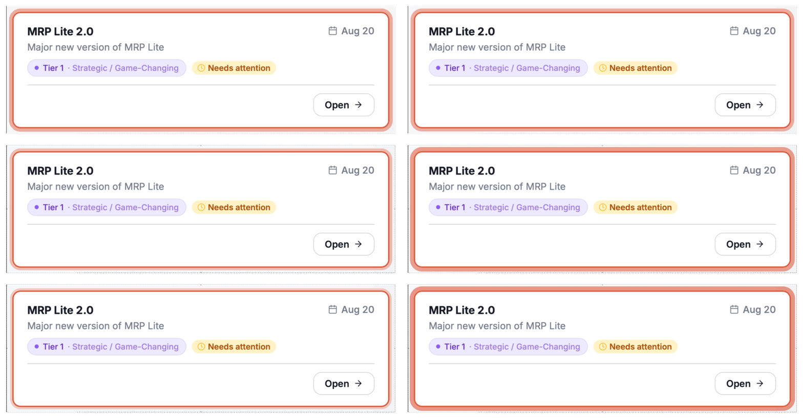
The effect is a kind of urgency that respects the person experiencing it. You know something needs your attention. You're not being punished for not having noticed it yet. This matters more than it might sound like it should, because alert fatigue is real — the more software screams at people, the faster people learn to tune out the screaming, which defeats the entire purpose of the alert in the first place. Breathing works because it's calibrated for a person who is paying attention some of the time, not all of the time, which describes basically everyone.
Some things don't get dismissed until you deal with them
Breathing draws attention. It doesn't force resolution. That's a separate principle: accountability at every step. Some messages in Launchible are not allowed to be dismissed with a passive click of an X in the corner. If something requires action or acknowledgment — a readiness gap, a dependency conflict, a change that affects a live launch — the message stays until the person it's addressed to actually engages with it.
This is a deliberate rejection of the pattern where "dismiss" and "resolve" get treated as the same action. In most software, closing a notification and fixing the problem it described feel identical from the user's side — one click, gone either way. That's how important things quietly disappear without ever actually being handled. In Launchible, if something matters enough to interrupt you, it matters enough to require a real response before it goes away. This is a small design decision with an outsized effect: it means the system's record of what was acknowledged and what wasn't is actually true, not just a log of what got clicked away.
Color has a job, not a mood
Walk into most enterprise software and you'll find color everywhere — a blue header here, a green accent there, a palette applied because someone thought it looked good, or because a brand guideline said so. We treat color differently: every color earns its place. Color is for purpose, not decoration.
If something is red in Launchible, it means something specific and consistent — it means attention is required. If something is a particular shade of a particular color, that color is carrying information, not just contributing to a look. This has a real cost: it means we can't reach for color as an easy way to make a screen feel more finished or more visually interesting. A screen with less color isn't a screen we failed to design. It's a screen where nothing currently needs the kind of attention color is reserved for.
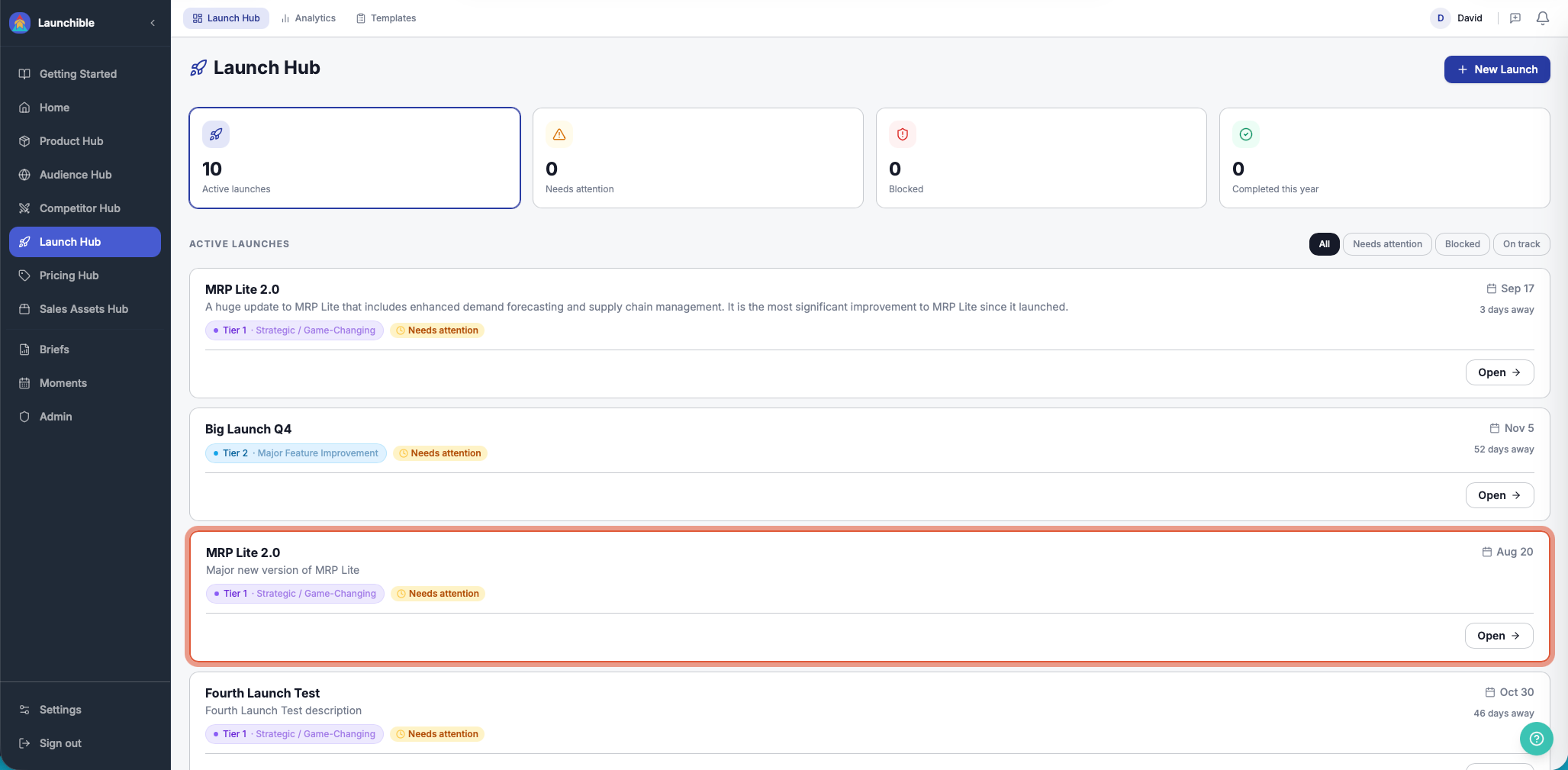
The payoff is that color actually means something in Launchible. When you see it, you don't have to wonder whether it's decorative or important. It's always important. That trust is worth more than a more colorful interface would be.
Software that looks ahead of you, not behind you
The last principle is the hardest to describe and the one that touches every Hub in the system: a belief that the software should anticipate what's important and point you toward a solution. Most software is reactive by design — it waits for a person to ask a question, run a report, notice a problem, and only then does it respond. Launchible is built around a different assumption: that a well-designed system should often see something worth flagging before the person using it thinks to look for it.
The clearest expression of this belief, developed as a direct result of holding it rather than the other way around, is the Signal Intelligence Engine — the part of the system that watches for changes across all six Hubs and routes what matters to whoever needs to know, before they'd have had reason to go looking. It's not a separate clever feature bolted onto the product. It exists because the underlying belief — that good software should anticipate, not just respond — demanded something like it. The breathing pattern is often how that anticipation actually reaches a person: something changed, the system already understood why it mattered, and now it's quietly, insistently, asking for a look.
None of this is about looking clean. It's about not making the job harder.
None of these six commitments — simplicity, avoiding context switching, breathing instead of shouting, accountability that can't be dismissed away, color that earns its place, and software that anticipates instead of waiting — exist to make Launchible look a certain way. Aesthetics were never the goal. The goal was a piece of software that doesn't add its own weight to a job that's already hard.
Launching a product is complicated enough on its own. The tool that helps you do it shouldn't be the thing you're also fighting.
Dave Daniels is the founder of Launchible and the author of the BrainKraft Product Launch Framework. He has spent 20+ years helping product and GTM teams close the gap between shipping and revenue.